Karel Martens @Stedelijk: Difference between revisions
m (→_about) |
|||
| Line 15: | Line 15: | ||
== <span style="color: white; font-family: Menlo; text-decoration:none; background-color: #0033ff; padding-top: 0.1vw; padding-bottom: 0.1vw; padding-left: 0.1vw; padding-right: 0.2vw;"> _highlights</span>== | == <span style="color: white; font-family: Menlo; text-decoration:none; background-color: #0033ff; padding-top: 0.1vw; padding-bottom: 0.1vw; padding-left: 0.1vw; padding-right: 0.2vw;"> _highlights</span>== | ||
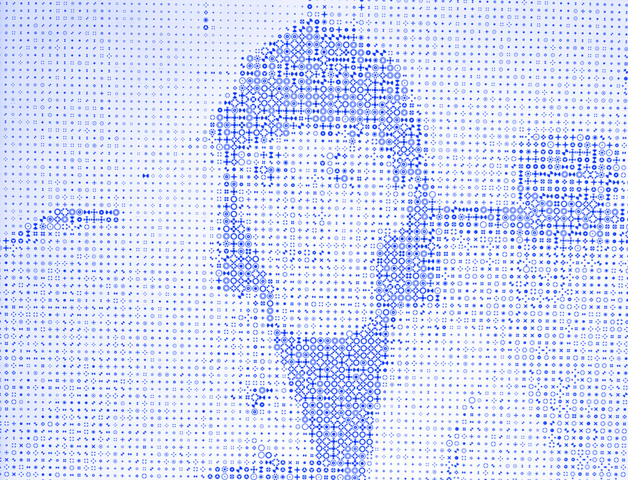
[[File:Karel-martents-1.jpg|thumb|Playing with Martens' interactive digital artwork]] | |||
🖤 the way the exhibition was sorted out // I liked that it was divided by periods, but technique as well. Each section was also described in a catalogue, so you can dig deeper into all of the exhibited works on the shelves. Probably the nicest shelf-based exhibition organisation I've seen so far. <br> | |||
🖤 patterns and rhythm, repetition // many works were based on minimalistic style and repetition, creating patterns and felt great when looking at them as a big picture. He is playing a lot with colours, but it never looks too busy - find that hard to reach. <br> | |||
🖤 interactive works // there was an area where a few interactive works were placed, so I got to enjoy his digital approach as well. Plus, you could read and explore many publications from and about him (some of which were also available at the museum shop). Nicely done, professional stuff ;) <br> | |||
== <span style="color: white; font-family: Menlo; text-decoration:none; background-color: #0033ff; padding-top: 0.1vw; padding-bottom: 0.1vw; padding-left: 0.1vw; padding-right: 0.2vw;"> _links</span>== | == <span style="color: white; font-family: Menlo; text-decoration:none; background-color: #0033ff; padding-top: 0.1vw; padding-bottom: 0.1vw; padding-left: 0.1vw; padding-right: 0.2vw;"> _links</span>== | ||
Revision as of 12:27, 31 July 2025
Karel Martens - Unbound
_about
The Stedelijk presents the first major retrospective of Karel Martens (1939), one of the Netherlands’ most influential post-war graphic designers, renowned for his inventiveness, and for his playful and experimental approach. Karel Martens trained and inspired younger generations of designers in the Netherlands and internationally. The exhibition is a journey of discovery through the oeuvre that Martens created over 65 years—from his adventurous lettering on buildings, to books, typography, postage stamps, telephone cards, and wallpaper. // source: exhibition official webpage
I visited the exhibition while I was in the Netherlands to free up my flat there, let it go for good, and reconnect with some of my friends there. I had the chance to spend a day in Amsterdam and really wanted to check out this exhibition, because I was quite sure I will get some nice inspiration from Martens' work. It did not disappoint me, indeed, I was inspired by some of his experiments and approaches to matter and printing.
_highlights
🖤 the way the exhibition was sorted out // I liked that it was divided by periods, but technique as well. Each section was also described in a catalogue, so you can dig deeper into all of the exhibited works on the shelves. Probably the nicest shelf-based exhibition organisation I've seen so far.
🖤 patterns and rhythm, repetition // many works were based on minimalistic style and repetition, creating patterns and felt great when looking at them as a big picture. He is playing a lot with colours, but it never looks too busy - find that hard to reach.
🖤 interactive works // there was an area where a few interactive works were placed, so I got to enjoy his digital approach as well. Plus, you could read and explore many publications from and about him (some of which were also available at the museum shop). Nicely done, professional stuff ;)
